Upping my custom form skills
During my commercial project development for the Zibarna Platform, I was tasked to work with MailChimp for gathering leads through their site. A simple sign-up form for their newsletter would do, yet I found that MailChimp’s out-of-the-box form failed to meet many guidelines for accessibility and usability. As minor as these issues are, they tend to leave visitors confused or annoyed. In an effort to increase leads (and eliminate frustrations), I set out to improve the form myself. A great way to brush up my form styling skills with the help of some custom coding.
But this sounds familiar?
The topic of improving forms are not at all new to my work this year. For my initial admission procedure to Newcastle College, I already wrote a short piece called ‘An introduction to User Experience Design‘ (Sterrenburg, 2020). This included references to ‘Inline Form Validation’, which means checking a user’s input while they are still filling in a digital form. This method is not widely used yet, and where it is it actually has a sizable chance of being implemented the wrong way. According to Baymard Institute (2016), of the 60% of websites in 2016 that used Inline Form Validation, nearly 20% had a flawed implementation which did not convert properly.
The most common issues surrounding form validation stem from a lack of user empathy. As developers use these systems everyday, as opposed to the wider public, they commonly lack the vision to look at it from a customer experience standpoint. This is expressed in using the right terminology for your fields, not relying just on color (think of the colorblind), among many other things. Accessibility means making your product work for the wide audience this world has.
For a previous project of mine (SellFable, 2019) I also implemented Inline Form Validation in the store checkout flow. Since the fields got color-coded dynamically for right or wrong inputs, the amount of completed orders has risen significantly.
Improving the Newsletter Form
The default signup form MailChimp provides leaves a lot to be desired from a visual standpoint. While it functions and generates leads for Zibarna, the stacked form fields with bad padding, and duplicate form captions as well as placeholders makes for an unpleasant ‘filling experience’. Count in the indistinguishable Privacy Policy link in the checkbox below due to the green color, and it is truly due for a makeover.
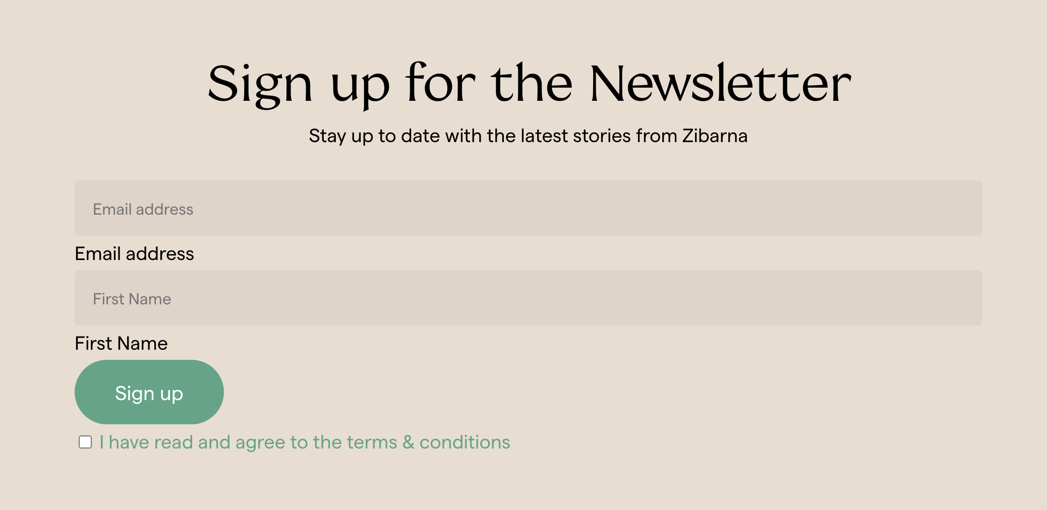
As a starting point, I separated the fields into columns instead to save space and make reading (which humans do horizontally) easier. On mobile devices, the fields do break to each their full-width of the screen, as we are dealing with much less space for columns there. This was relatively easy to do with the help of CSS’s Flexbox.
Changing the fields to white instead of the default grey makes it easier to navigate to the fields. While they are the same size as before, the fields appear bigger partially due to the color and due to the placeholder text inside being a bit larger. According to Fitt’s Law, “the longer the distance and the smaller the target’s size, the longer it takes” (Interaction Design Foundation, n.d.). By making the form field stand out more, it will take less time for the user to start interacting with it.
On a similar note, the checkbox for agreeing to the Privacy Policy was replaced with a small footnote. Compared to this much smaller footnote, the ‘Sign Up’ button appears much larger and more prominent, indicating a more important action.
The (ful)filling experience
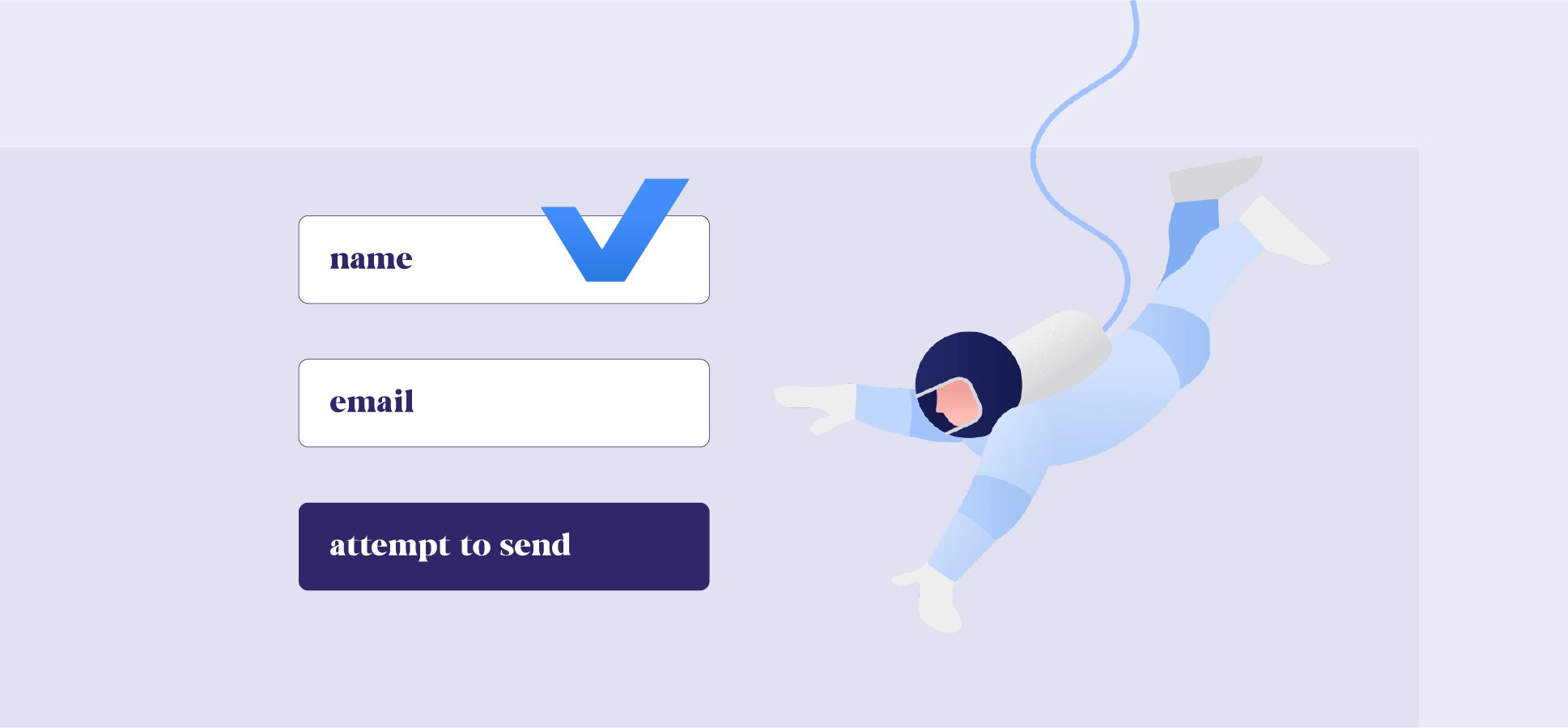
But the main improvement of the form, is one I actually wanted to make for a long time but for the first time got to work with Zibarna. One of my main frustrations with forms these days is when you have filled a field, you no longer know what was asked in it unless you read your answer. But then there is still no way to check if your answer matches what was asked.
This issue can be solved by simply moving the placeholder to the label on top of the field (like SellFable), but this takes more space and is a less-clean look, which I wanted to maintain. So, I started experimenting with a way to show the field label when filling/filled, by moving the label up from the answer you have typed. Google actually does this very well, which is partially where I drawn inspiration from.
Google moves the form placeholder up towards the border when filling, keeping it visible.
However, the catch is that I would not want to use other coding languages such as Javascript in order to make this work. Any extra piece of code is a liability, and makes the site slower. So I wanted to find a way to achieve this with pure CSS code, which is generally much less demanding and much less typing.
After doing some research, I found an article by Zell Liew: “Checking if an input is empty with CSS” (2018). While this article went a few steps further than I did, it did attend me on the ability to check a field with simple CSS code. Using a variation of this code, I was able to hide the top placeholder when nothing was typed, and show it when a user has filled the field. While this is a much simpler approach than Google has taken, this works flawlessly with no drawbacks. Even on the Edge browser, which according to the article was not yet supporting this method back in 2018.
The observant viewer might have noticed that in the original MailChimp form, the field label was actually positioned underneath the field, whereas with my adjustments it is on top instead. I had to intentionally move the label underneath the field in order to be able to target it with my CSS code. As with CSS, you can only change code that comes later from the one you are currently checking (in this case whether the form field itself is empty).
I suppose there is a reason to use Javascript instead after all.
Sterrenburg, C., 2020. An introduction to User Experience Design. [pdf] CS Websites. Available at: <https://cswebsites.nl/wp-content/uploads/2020/04/User-Experience-Introduction_Newcastle.pdf> [Accessed 18 March 2020].
Holst, C., 2016. Usability Testing of Inline Form Validation: 40% Don’t Have It, 20% Get It
Wrong. Baymard Institute [online]. Available from: <https://baymard.com/blog/inline-formvalidation> [Accessed 18 March 2020].
Interaction Design Foundation, n.d. What is Fitt’s Law? [online]. Available from: <https://www.interaction-design.org/literature/topics/fitts-law> [Accessed 18 March 2020].
Liew, Z., 2018. Checking if an input is empty with CSS. Zellwk.com [online]. Available from: <https://zellwk.com/blog/check-empty-input-css/> [Accessed 18 March 2020].