Web Design for Usability
My main focus this year is gaining new insights and gathering knowledge, to use in the commercial practice that is my freelance work straight away. This cycle repeats for everything I do. One of the best ways to learn about my field of work (User Experience) is with the Interaction Design Foundation (short: IxDF). They offer quality courses from industry veterans, divided equally in both text and video form. Unlike companies like Udemy or Coursera, the IxDF offers an all-access pass to all their content and a tight community of like-minded UX geeks both locally and globally.
I recently finished my first course: “Web Design for Usability” by William Hudson (1). And while it was not a very long course (compared to the ones I am taking now), it did offer me a lot of new insights or views on topics I was already aware of, as well as completely new things or theory.
General experiences
The course tackles some important issues of how modern-day websites often leave their users behind when it boils down to pure usability. As a designer, we are often busy with thinking about what looks right and how to make a visually pleasurable experience to our end users. This is without a doubt important, but often sacrifices usability without being aware of it.
“Web Design for Usability” covers a lot of ground for the length of the course, and talks about both the philosophy and theory of what we can do to improve usability. It also briefly covers some practical topics to use when designing or developing the actual website, and while I did expect some more in-depth examples, the course is a ‘Beginner’ level one. This will be a step towards doing more advanced courses like the ones I am doing right now, which feature more text-based research and longer lesson blocks.
Key Takeaways
During my courses I make notes of the most important things I want to keep, and try to incorporate that in my work. After taking this course, I have a few major takeaways I will keep in mind:
- Usability is a requirement, not an item on the wishlist.
Countries actually enforce laws and international standards on ergonomics, usability and human-centered design. This has even lead to lawsuits and hefty fines for companies as big as Domino’s, where a blind man was unable to order food due to a bad website (2). Agencies often have ‘Usability’ in the form of an extra fee or upsell, which in my eyes is totally unacceptable now. - The Technology Chasm
When creating a product, there will be ‘early adopters’ who try out your creation before the user majority will be able to use the full product. These early adopters take issues or bugs for granted due to sheer enthusiasm, but the majority that follows prove the real challenge. They will not accept that, and the designers needs to make decisions on what to fix accordingly. - The Golf of Execution and Evaluation
This method of design thinking allows for clear usability guidelines for every product, but is especially important for experiences such as eCommerce checkouts. The ‘Execution’ and ‘Evaluation’ pieces both have two important ‘goal mapping questions’:
1. How do users know their goal is attainable?
How do I know (indication) I can actually buy this product? (A mention of a store)
2. How do users know what to do?
How do I buy this product? (Is there a buy-button, or do I have options?)
3. How will users know they have done it right?
Do I see anything change? (A ‘1’ appears on the Cart-icon, or the Buy-button changes?)
4. How will users know they attained their goal?
Can I buy the product now? (Is there a new ‘Checkout’ button, or am I redirected to the cart?)The best responses to these questions are a direct ‘Yes, because of ‘, which is a Direct Match. These are often the same across many websites and cause the expectations of a customer to be set before the action is performed. As a customer you expect to see payment/shipping options when pressing ‘Checkout’. This is a direct match. - User Stories vs Persona Stories
User Stories are widely used across the industry, but suffer from serious flaws. User Stories generally go as follows: “As a , I want so that “.
These get highly repetitive to write and become more of an abstract picture rather than a serious plan, due to the constant ‘As a’ prefix. It also ties certain actions down to a job, rather than allowing individuals to use the site. It restricts the amount of actions that can be taken.
A persona story solves this by removing the prefix, putting focus on the task rather than the goal (allows better design thinking) and working with persona’s rather than jobs.
” so that “. - Navigation Menus
The navigation of a site should reflect the site’s concept, as well as be consistent with navigations across other sites of the same industry. This hooks in to a broader point of terminology, which is best to keep familiar to the users of your site. In practice, use ‘About Us’ rather than ‘Company Narrative’. - Fitt’s Law
Fitt’s Law states that the size of a target determines the impact of the action. If a Buy-button is large, it is more attractive as an action. In a Usability aspect, if a menu button is larger, it is easier to hit that target on a mobile device. - The Gestalt Principles of Perception
This is actually a topic I want to do a full course on, so it is a great introduction in my first course. A great companion to the abovementioned Fitt’s Law, the Gestalt Principles focus on ways to convey similarity and structure in a design. ‘Proximity’ (if an item is close to another item and has no space between it, it must be related) and Similarity (if it looks the same visually, it must be related), Continuity and Closure. - Change Blindness
When two very similar screens with minor differences are shown, but are seperated (as briefly as a millisecond) by a blank screen, this different is very hard to spot. When the transition is direct, you can easily see what has changed. But when, for example, a website refreshes and seperates the frames with a white loading frame, you will not be able to spot what changed. This is why it is important to animate elements if they are important for usability.
Finally, a quote of Steve Krug really stuck with me. About the use of content in our website to convey important messages. To really get to the core of your message:
“Halve your text, then halve it again.”
– Steve Krug
Course Wrap-up
Some of these things I have learned will be (or have already been) applied to my work. I know the Gestalt Principles of Perception and Fitt’s Law will be playing a much bigger role in my design work to come and look forward to testing it out and seeing the results of it. Navigation Menu’s and which terminology they contain would be a great opportunity for me to use Card Sorting for with the client. In general, I do think I already relate to the visitor quite well in vocabulary usage, depending on the project.
Reflecting on my past work with this new knowledge, it is crucial that I pay (even) more attention to usability of my websites in the future.
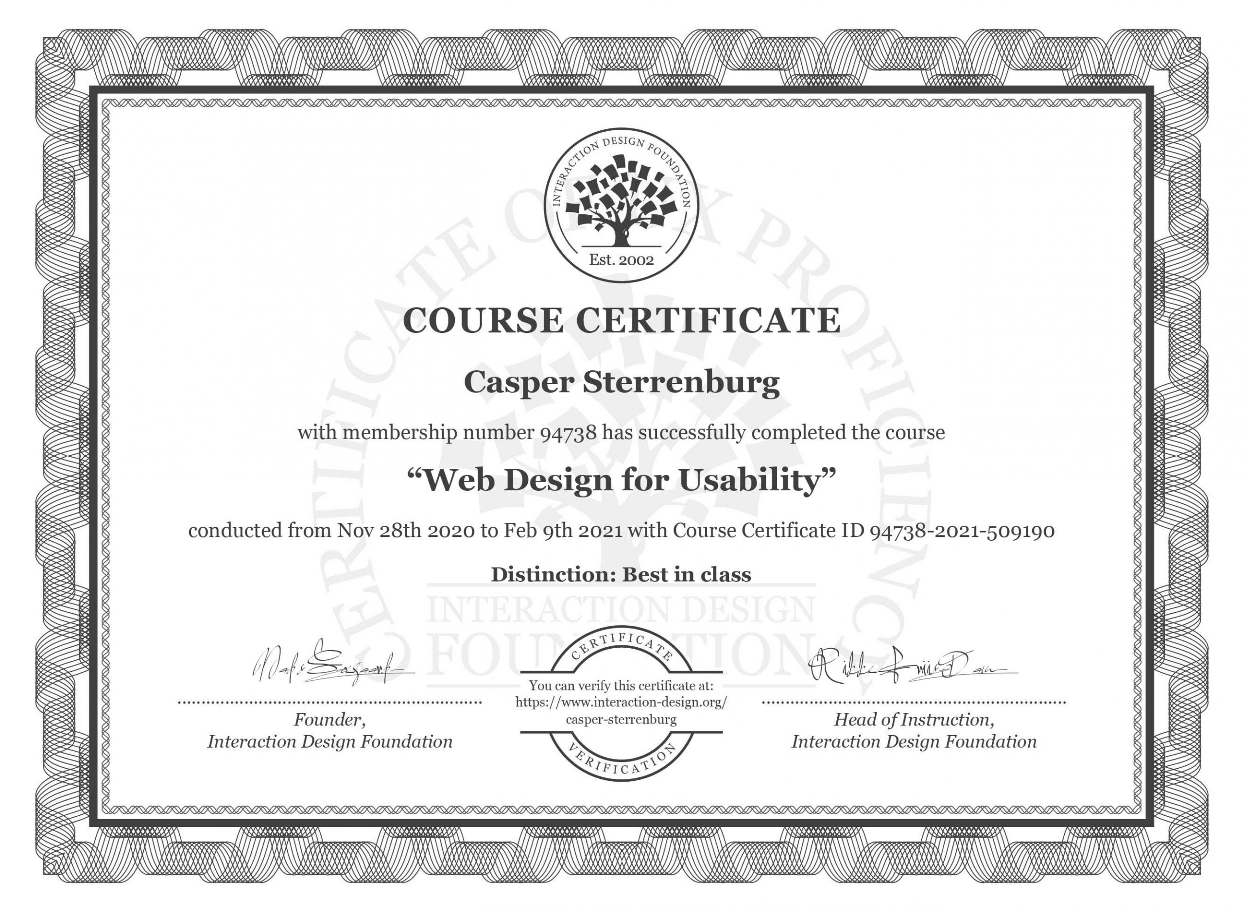
In the end, I finished the full course without making any errors (100%) and full marks for my open-ended questions, demonstrating I am fully able to practice this new material. This results in a ‘Best in Class’ distinction on my course certificate as well as being in the Top 3 Best Learners of the Netherlands for this course, which motivates me to keep going even more. I look forward to using my new knowledge in my work, and taking new courses.
Referenced Materials
(1) Hudson, William (n.d.), ‘Web Design for Usability’, Interaction Design Foundation, https://www.interaction-design.org/courses/web-design-for-usability. Accessed 10 February 2021.
(2) Higgins, Tucker (2019), ‘Supreme Court hands victory to blind man who sued Domino’s over site accessibility’, CNBC, https://www.cnbc.com/2019/10/07/dominos-supreme-court.html. Accessed 10 February 2021.