Project Introduction
Briefly written about in my Project Development document, August Homes was the very first project for many aspects of my development this year. The first project in partnership with a colleague freelancer, Alla from Javasloth Studio, which has given me much more precise grip on working with a brand identity throughout the product strategy. But also the very first product on which I conducted UX Research and created a UX Wireframe. This marked the first step in the Product Experience Strategy which I am creating this year – and immediately introduces a great new value product to my customers. Spoiler alert? It was enthusiastically welcomed.
The Company
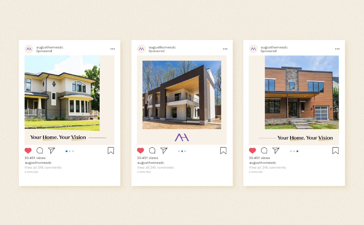
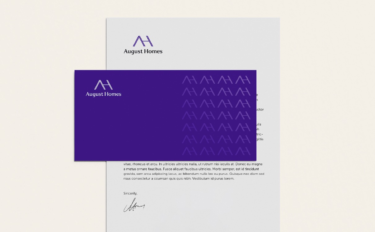
August Homes is a premium home builder based in the United States. They create custom (or templated) homes in the Washington DC area, and pride themselves on their eco-friendly solutions and real family-style craftmanship. They were in need of a total refresh of their corporate identity, including their visual brand and a new website to go with it. The Brand Identity was developed by Alla from Javasloth Studio, and handed over to me in order to create a website from it. During the design process, me and Alla had close contact which allowed me to stay in touch with the design and direct where needed on the design, and she was allowed the same during the development of the site. The cohesiveness of different brand deliverables was immediately apparent from this partnership of which both me, Alla and the client benefitted. And ultimately the customer too!
The UX Wireframe
For this project I started out researching competition websites in the area, and how they market their segment. For August Homes, being more high-end than the competition majority, this was more difficult as competition sites are relying on aggressive selling and marketing. From my experience, a good product sells itself and requires no hard selling – as it will stand out in the crowd on it’s own.
A large portion of these competition sites used the same terminology for their navigation menus. During my Interaction Design course “Web Design for Usability” I learned that it is important to keep terminology consistent across the industry and use familiar language. Once completed I will write more about this course in a separate post.
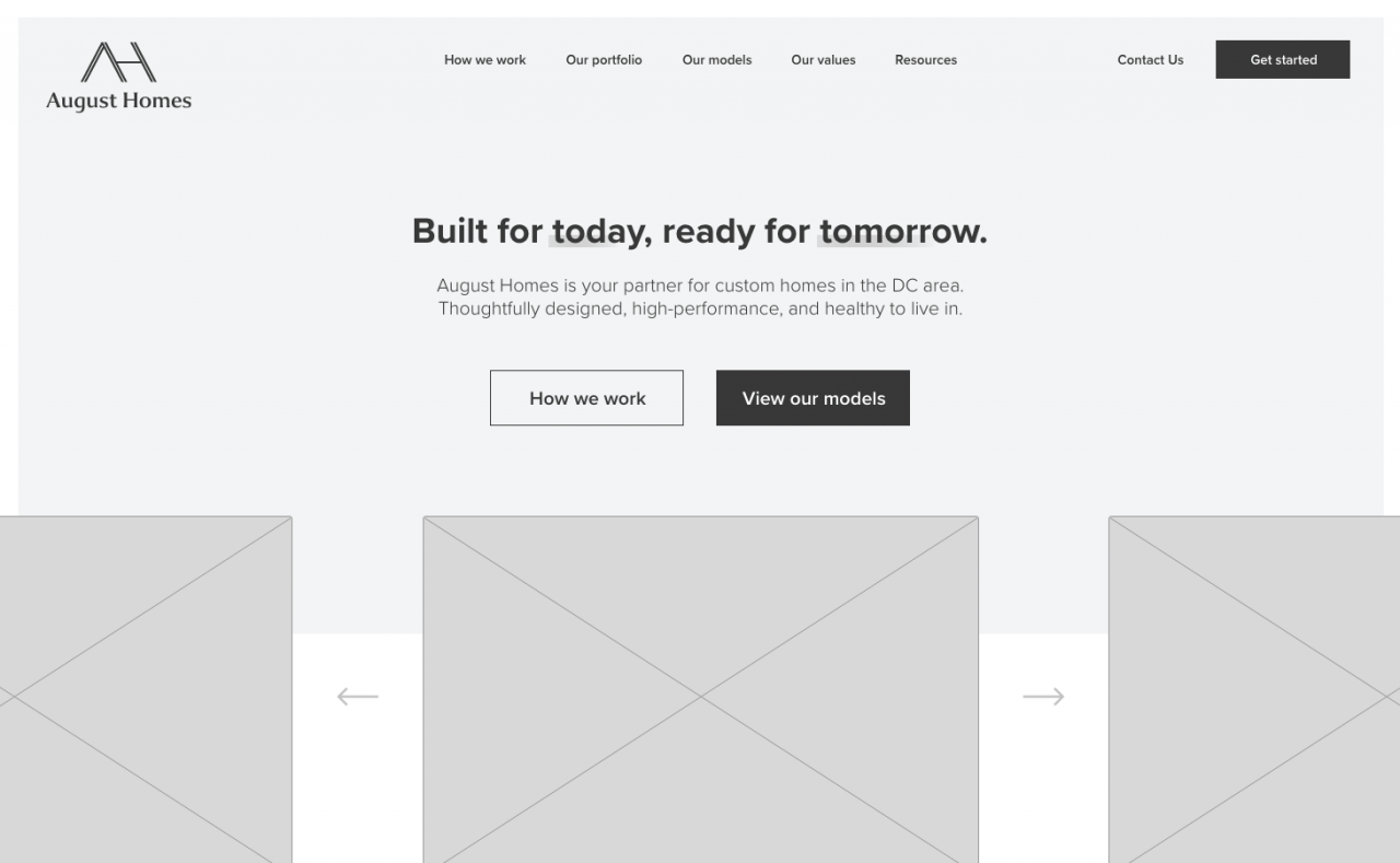
Based on relatable terminology and the content August wants to showcase, I made a sitemap as the first part of the UX Wireframe process. This sitemap was shown to the client as well, after which we made some small terminology changes, such as changing ‘Our values’ to ‘Our difference’ for clear content reference, and removing the Resources page (as it was moved to Contact instead).

Personally, I believe in creating work and improving it as you go – not in creating a template and test it on a real project afterwards in the hope it ‘works’. For August Homes, this meant I created the UX Wireframe template as I worked on the UX for this project specifically, which did result in this project taking considerably longer than future products. Luckily, the client was okay with that, and so I had time to perfect it as well as ‘templatize’ it (word invented?).
For this to work across all future clients, I created the UX ‘Dashboard’ which serves as the starting page for every UX Wireframe. It has the client’s name on top with the logo for easy personalization of an otherwise grey page. On a similar note, I can change the color accents for each client from one single value, which updates all the colors used on the Dashboard. Because the backgrounds are simply the accent color with opacity, this makes just one value to edit for it all!
On the left it features the navigation to quickly open any of the inner UX pages. On the right I added space for two tiles, one of which brings you to the earlier mentioned Sitemap, to be viewed right from the same screen as the wireframe. The second tile is for futureproofing. Currently I’m thinking of adding a ‘Roadmap’ to the Wireframe to indicate the different plans/sprints of the project. It also has a small hint at the bottom to indicate you can use the arrow keys to navigate the wireframe artboards, which I personally found very useful (even though I learned about it very recently, and by accident).

Wireframing, and developing
After I finished the template-pages, I started creating the UX Wireframe for the whole site. Since I had done this earlier for DPDK (the agency I work at) this felt natural already. But as always it is a difficult task involving a lot of trial-and-error, revising and redesigning. Luckily I was able to re-use some of my components and when redesigned to fit my companies’ design style, they served their purpose perfectly. All the components I made for this UX were also placed in my Component Library so I can re-use them later, which saves a lot of time.
I highly recommend checking out the full UX Wireframe.
I went through the full UX Wireframe with the client during a call, and given him access to the link to leave feedback for me to use. He only left a single piece of feedback.

Perfect! Let’s move on.
I’d wager to say that calling through the whole document and explaining your choices, eliminates the majority of what I would call ‘bad feedback’. In this case that worked very well.
Locally I developed the website using WordPress, closely following the UX Wireframe while incorporating design that came back from both the Client and Alla. In the end, the website was translated very well and both the client and I are proud of what we have done. Personally, I would write down the success of the UX Wireframe as a result of knowing what you can do with the tech, and making Wireframe decisions in the earlier stages based on what you can and cannot do. Something I did not do at DPDK (as we had many different – and new – solutions).

So, what’s next?
Looking back at the project, it overall went very smooth without encountering major hiccups or showstoppers. The handover from brand to web was handled well, and I was able to create a website identity quickly using the set brand guidelines provided by Alla. My biggest plus being a freelancer is having the ability to directly answer client questions and maintain good communication. With this partnership I was afraid having two teams may delay and trouble client communication like agencies do. However, the client was very responsive and was able to follow both our internal communication as well as the calls very well. The new website is used by the August Homes team with pride, and I feel the same way about using it in my portfolio.
Following this succes, Alla and I currently have more work planned together for 2021, including new commercial projects. Until then, I have the time to refine my UX Wireframe for more clients, grow the Component Library, and also add the Research document to my Product Experience Strategy. By then, I can start testing it on the new projects.
A solid timeline for many other products, but that is reserved for a future post.